Thursday 31 August 2017

Coffee and Cards - Dragonfly Dreams

A while ago I managed to get to my favourite card group for a chat, coffee, cake, oh and to create a couple of cards in the process. I find the whole event quite relaxing as I don't have to think about the design; that isn't to say I follow slavishly. I don't, sometimes developing my own take and not completing them until I get home. The smaller of the cards showcased here is a point in case. We used the gorgeous Dragonfly Dreams for both cards.


For the first card we stamped and coloured 2 of the bees before fussy cutting them out. Those that are eagle eyed will have noticed that there is a bee die to correspond with the stamp, however, it doesn't just cut around the edge which we wanted for this design.

Now although I loved the little bees, I decided that I wanted transparent wings. I chose not to attach them to the card until I had adapted them. Once home, I stamped the bees onto vellum.. I fussy cut them out and used Wink of Stella on the wings for a touch of shimmer. I then cut the wings off the originals before mounting onto the vellum for a slightly more delicate effect. You can see the difference it makes here.

I also chose to mount my embossed card at a 45° angle for interest as well. In fact even my sentiment was positioned in a different place! Good job I didn't completely alter the second card...


For the second card we created a similar design but stepped up. This time we used the dragonfly, coloured with the water colour pencils and blending pen. I'm not sure why I don't use the pencils that often; they blend beautifully as you can see in the picture below. Again I used a Wink Of Stella on the wings, sorry it doesn't show up too well in the photo.


You may have noticed I used Washi Tape; it certainly gave Susan a bit of a surprise. I even tore it too. I actually liked the effect on this card even though I'm not known for my love washi tape or grungy effects. My only concession was that I chose to use the same design above and below the narrow tape rather than three different ones.
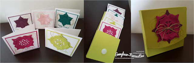
The finished cards


Tuesday 29 August 2017

The Joy of Sets Design Challenge 5 (Letter J) - Jar of Love meets Tranquil Tulips

Hello, goodness what a palaver this fortnights challenge turned out to be! There are very few Stampin' Up stamp sets that have a "J" in the title. Luckily I have Jar of Love - one of my favourites so I hope it won't be retired next time around.

If you've seen any of my recent posts, you'll know that I took delivery of quite a large (for me) SU order. I've challenged myself to use all the sets I bought as quickly as I can. I also have been very conscious that I hadn't used any of the new In Colours yet. So what better time than for the JoS challenge to use a new stamp set and colour? Here's introducing Tranquil Tulips and Fresh Fig with, of course, Jar of Love. I hope you like my choice.

This is a hostess stamp set you can get by holding an SU party. Contact your local demonstrator to arrange a suitable time and date, invite friends, add cake and you have yourself a fun crafty event.


I stamped the jar on Whisper White using Smoky Slate and then added "water" in the form of Pool Party stamped off for a paler shade. A couple of tulip heads, stems and leaves were stamped onto scrap paper and fussy cut before adding to the card with dimensionals to give a raised effect from the jar. I like to think maybe someone was arranging a bunch of flowers before being distracted mid way through. A small gold bow was tied around the 2 stems too for a hint of bling.

Three tulips were stamped directly onto the main card - this is a 2 stage stamp - along with a few leaves. It probably took me longer to decide on the leaf placement than anything else. Oh to be decisive... I did a little watercolouring to ground the jar and added 3 of the White Perfect Accents that I coloured with a Promarker. I haven't added a sentiment yet but I think when I do it will be inside the card. I hope you like it.


Saturday 26 August 2017

Think I'm in Love...

On my last post I showed you a card I was commissioned to make for a birthday. Well I loved it so much that I made several more cards over the following days that were based on the same design. If you need to batch make cards or need one in a hurry this is so easy and so effective whether for Christmas as here with Merry mice, which has sadly been discontinued...


to say thank you to someone, using my favourite flower stamp, Birthday Blooms,,,


or to welcome a new baby, this time with Moon Baby...


The possibilities are virtually endless! 

Thursday 24 August 2017

Pretty Kitty

Late last night I was asked to make a card for a friend. The brief was that the recipient was going to be 19, liked the colour blue and loved cats and baking. I didn't get the Perfect Mix stamp set when it was available as I didn't think I would use it enough. On reflection, maybe I would but not to worry, as a hobby demonstrator I have to pick and choose my sets carefully. Perfect Mix lost out to Pretty Kitty, which is a regular on my craft table.


I decided to use a soft, pastel palette and so based my colours around the base card in Soft Sky. I can't deny that for this card I took my inspiration from one I saw on Pinterest made by Kirsten Aitchison. I loved the clean simple lines.


Just a selection of the colours used! I can't believe that I actually used 10 ink colours; 3 of them on the ginger kitty.


First of all I stamped my sentiment on the bottom right of a piece of Whisper White card. Then I die cut the word "congrats" carefully keeping the tiny pieces from the middle of the letters for later.


I chose 2 designs from Pretty Kitty that work really well together and stamped them as close as I could so it looked like one image. A spot of colouring using ink pads and blender pens and the card was ready to mount on the base.


Remember I said to keep the little bits from the die cut sentiment? A quick tip when using a sentiment in relief. Place the diecut back in the space as shown above so you know where the tiny bits need sticking onto the base card. Once they have adhered you can remove the sentiment to use on another project.

The sentiment is actually in relief although it doesn't show up on the photograph


Tuesday 22 August 2017

Summer by the Sea at High Tide

Sometimes you just HAVE to have a stamp set you see, regardless of whether it's current or not. For me it has been Summer by the Sea, which was released oh so long ago in 2004! I first saw it on The Joy of Sets Facebook Page and was so lucky when someone offered to sell me it when I added my request to an ISO page.


 I love the delicate drawings, they almost sweep me up in a hug. I look at them and feel that no matter what, everything will work out right in the end.


I wanted to use High Tide with my chosen image as I felt they would combine well. First of all I roughly sketched my idea in my notebook. Then, to check it would fit, I plotted my card size on the squared paper and roughly stamped the design in basic black ink. It meant I could see where adjustments, if any, needed making prior to committing on good card.

Once ready I stamped the girl onto Shimmer card. Then using my precision press, I placed the first of the lighthouse stamps; this is a 2 stage stamp set. I used Dapper Denim and stamped off on scrap paper first to get a lighter version. I then used the second lighthouse stamp, using the ink at full strength, I found it easier to do this and then add the outcrop the lighthouse stands on.


I stamped my image onto a post it note, incorporating the adhesive, and cut it out to create a mask. When stamping scenes where you layer stamps, always start with the image in the foreground. If you've never attempted this all will become apparent soon.


I also created a light wash in So Saffron for the sand to help tie in the lighthouse.


Place the mask over the corresponding image. For this dexign I didn't need to cut it all out.


I then placed the dry stamp where it needed to be to check my mask would work. Once happy with the placement it was time to ink up and go for broke. I also stamped over my colourwash very lightly to continue the sandy look.


Still using the mask and also using one for the lighthouse, I stamped the water. A quick colour wash for the sky finished the background. So far, so good.

Masks were removed so that I could colour the girl. Did you know that a mix of Blushing Bride and Crumb Cake make a great Caucasian skin tone? I stamped a few tufts of grass too. Finally before mounting onto my base card, I let my image dry and then weighted it under a box of dies to flatten out.


I hope you like the finished card,


Saturday 19 August 2017

Ahoy there...I saw Three Ships

Hello again, thanks for stopping by. Well it was more like little sailing boats! Once again I'd gone to Coffee and Cards, mainly because I wasn't at all smitten with this stamp set when it came out and wanted to see what could be done with it.


Needless to say, I came back fully inspired and will be adding this set to my basket next time I place an order. Funnily, I already have the coordinating dies as I thought of so many ways to use them!


I made 2 cards, the first of which is a handy note cards size. For this one, I used watercolour card and created a sea and sky using Pool Party and Island Indigo. Each element of the boat was stamped on scrap card and cut out and stuck down onto the water coloured background with dimensionals. A simple sentiment and 3 rhinestones completed what is a very simple but effective card. As usual, I stamped the envelope and the inside of the card to coordinate, Most of us struggle with cards for men but I think this would be perfect.


For my 2nd card, this one slightly larger, the sea was made using first and second generation stamping with the splodges out of this versatile set. Not quite the replacement for Gorgeous Grunge - I personally don't think anything else will be - but they do work rather well. The waves have been cut from Dazzling Diamonds Glimmer Paper which adds some sparkle and picks up on the Pool Party splodges. 


I stamped 3 boats and fussy cut them out, tucking 2 behind the waves and leaving the central one on top. They were all stuck down with dimensionals to raise them slightly. The splodges are used behind the sun too.


 I thought this card looked rather calming so chose to add a sentiment for someone retiring. Normally I try to keep them fairly generic unless I'm making for a commission. And just to show great minds think alike over a second coffee afterwards, we thought with a little tweaking and a change of colour this could make a great Christmas card. Watch this space.


Thursday 17 August 2017

Once started... A Little Box of Flowers

Hi there, it appears that making 3"x3" cards and boxes to put them in is quite addictive! Still there are worse things to do in life. This time I used 2016-2018 In Colours and last years corresponding DSP which is sadly retired, alongside the Flower Shop stamp set. I also used Petite Petals and the corresponding punch.


This time I made the box fastening slightly differently; instead of adding velcro fastenings, I folded the card over and rounded the edges so it would tuck in easily.

I also made a small band from the coordinating DSP and added a punched flower to correspond with the hand stamped paper that decorated the box. There is something rather therapeutic about stamping your own paper


The small sentiments on each card were taken from a range of stamp sets as usual. I like to put a selection into my sets, to cover various occasions. I hope you like them.


Tuesday 15 August 2017

The Joy of Sets Design Challenge 4 (Letter B) - Birthday Blooms

Hello, this week our challenge is to use a stamp set with the letter B in the title. Once again I went for Birthday Blooms. The other week I mentioned I had several ideas for this stamp set? Well this is the 2nd design I came up with that day based on the same theme.

One of my favourite stamp set

I chose to make a card to fit a DL envelope so although A4 cardstock is just short of 30cm in length, I cut across at 20cm and scored at 10cm. The remaining piece, once trimmed at the side was perfect for my top layer. I do so hate waste. Between the base card and top layer, I added Blushing Bride so that it created a narrow border.


Once again I used the Scalloped Tag Topper punch to create a cute tag in both vellum and Whisper White cardstock. This is a really card to make, I think less is more in this case but it does require careful measurement as there is nowhere to hide mistakes. Each of the 3 flowers line up in a row so to ensure they were level I brought out my trusty stamping press. 


The flowers stamped on card were water coloured loosely, going over the lines of the image. For the flower on vellum I chose to use ink and blender pens to colour in from the back as it had been heat embossed.


Did you know that you can colour the White Perfect Accents using Promarkers? Although I don't have that many I managed to find a reasonably good match for Blushing Bride as you can see in the picture. These 3 Perfect Accents balanced out the sentiment, stamped directly in the top left corner. I also wrapped some silver Metallic Thread round my fingers in a figure of eight before adding behind the tag.


Saturday 12 August 2017

A Little Wild Part 2

Hello, the other week I promised I would show the second card I made at Coffee and Cards run by Susan, Craftyduckydoodah, featuring the A Little Wild bundle. The card we made is based on the card featured in the photo on the right. However, whilst the base card was coloured, we included a layer of white as well for a lighter, brighter effect.


The cute little lion was stamped onto a white circle from the Stitched Shape Framelit dies and coloured with, shhhh, Promarkers.


 I'm hoping you can see the design behind the mounted circle; it isn't embossed but is one of the dies from the A Little Wild bundle, cut 5 times and stuck onto the card. I also used the Mini Sequin Trim in gold for a little sparkle. I'll let you into a little secret; instead of using one long piece of trim and hiding so much behind the circle, it's actually 2 much smaller pieces. Well it's too nice not to see!


As usual the design was stamped inside the card and also on the envelope for a fully cohesive look. It's the finishing touches that make all the difference I think.


Thursday 10 August 2017

A Little Wild Afternoon

Hello, if you have read my blog before you'll know that I often go to a Coffee and Card session one afternoon a week that's run by Susan, aka Craftyduckydoodah. We used the new A Little Wild bundle; it's so cute. You get the front and back of the animals and the dies keep them joined so you can make up tags. Have a look to see what I mean. Of course if you want to separate them as we did a quick snip with the scissors soon sorts that.


As always, we were given a choice of colours to use for the first card which featured an elephant. This card tends to be the simpler of the two, designed to ease any newcomers or non crafters in; it is very often slightly smaller, being a handy notecard size.


I chose to be different to the rest of the group and used the new DSP in Powder Pink as I thought it would make a great baby card for a girl. Isn't it sweet?

I stuck the DSP onto the card and then used one of the circle Stitched Shapes Framelits to create the aperture. With the card closed I then stuck the patterned circle that was cut out onto the inside of the card. It helps to have the card closed so you can line up the pattern and place  it in exactly the right position.

The elephant was coloured, die cut and snipped apart.  I carefully stuck the back of the body down first to make sure he was at least straight and stamped some grass underneath for grounding. The head was attached to the front If I made this type of card again in landscape style, I would have the fold at the side. There is a reason for this, as the back of the elephant looks upside down when you open the card. I like to think he was so excited that he was caught mid cartwheel!

When I got home I had an idea of how to step up the card just a little bit. It's pretty as it is but I just wanted to add a little more to it. So, I decided that maybe the elephant could hold a couple of balloons on a string. I also added a generic sentiment so this could be for a little girl's birthday or a new baby card. Which do you prefer?

I added clear Wink of Stella to the raised balloon for added sparkle after the photo had been taken.

I did make a second project, using the lion which will be featured in another blog post at a later date.


Tuesday 8 August 2017

A Box Full of Cards

Hello again, a while ago I was very kindly given the new In Colours for 2017 – 2019 plus a 6” square sample of each of the new coordinating DSP. They have been sitting here mocking me to actually stop looking and start using them. After my recent craft room sort out and tidy up, I found a pack of 3”x3” cards and envelopes and thought it would be quite cool to make up a pack of 5 cards and a box or bag for them to go in. Seemed to me like the perfect marriage; a set of small cards in the new colours! How could it go wrong as they will make rather cute little gifts for friends and family.


I chose to use the Eastern Medallions Thinlits dies, another set recently purchased. They fitted perfectly. As the card bases were white, I die cut a white square using the largest of the Stitched Shaped Framelits attaching it to coloured cardstock leaving a 1/16border using my Perfect Layer rulers for accuracy. I die cut the Eastern Medallion shapes, so I had one in each colour to match the cards. After adding some gold metallic thread behind each medallion, I attached one to each card with glue dots. Each card was stamped with a small sentiment, I chose a different one for each card from a range of stamp sets.


Usually when I make boxes and bags I go to my trusty friend, Pinterest, for help. I follow several demonstrators, some who seem to specialise in 3D projects. This time, however, I took a piece of rough paper, sketched my design and worked out how to deconstruct it; it’s a good job I listened to my maths lessons on fractions oh so long ago! Ok so I know this was an easy project to start with but it has inspired me to have a go at others in the future.

To make the box; 

Cut an 11" x 4⅝" piece of cardstock.
Score - on the long side at 3⅜", 4", 7 ⅜" and 8" 
and on the short side - ⅝" and 4"  I'm not going to give full instructions as I think once the score lines have been folded and burnished, it should be self explanatory especially with this picture. I did use red double sided tape as it is strong so won't come apart over time. I also used 16mm round Velcro stick ons for the fastening.


I gave this set to Susan, my upline as a small thank you for all the help she gives me. I realise it's like taking coals to Newcastle, giving a crafter a ready made set of cards but I do hope she likes and can make use of them. So, onto the next set...


Friday 4 August 2017

Happy Birthday Christine's Mum

Hello there, today I thought I'd show you the 2nd card I made for Christine. The first one was for her daughter's 14th birthday and this one for her mum's birthday. The design brief was "something with flowers but I'll leave it up to you." The other week I took delivery of a reasonably sized Stampin Up order - well by my standards anyway. As a hobby demonstrator I try to order once a quarter if I can so each parcel is jam packed full of goodies. Amongst my new stash was the Wild about Flowers stamp set. I#d been eying it up for a while and couldn't wait to try it out.


It's funny because since Wimbledon started I seem to have gravitated towards purple and green, must be a subconscious choice. It certainly wasn't planned, I'm not that organised.

I created my background by stamping off first to get a softer colour. I love cottage gardens and wanted to try and recreate a slightly wild and wooly effect with flowers jostling for position.

Using full strength colours I stamped one of the flower stalks onto white card  along with the flower heads. It really doesn't matter if they they don't align perfectly. I then die cut it out using a die from the Lots of Labels set. To make it stand out more I mounted it onto a slightly larger die cut in Perfect Plum, taken from the same set. Three gems and bugs strategically placed on the card just added a little extra zing. I always try to use an odd number as it has a more pleasing effect on the eye.

Now I don't know about you, but I really struggle to stamp sentiments straight. Sometimes you can get away with stamping on a scrap and either punching or die cutting which is very forgiving. But this time I wanted to stamp directly onto the card; not once but twice! I've worn glasses since I was 4 years old and as I've got older, my eyesight has increasingly got worse; sometimes I struggle to see the letters on the keyboard. And I've always had problems with straight lines! So, out came my trusty stamping press - it really does earn it's keep. With a practice on scrap paper to check alignment first, once I was happy I committed to the card. I think it looks ok, maybe you can see a slight slant? Anyway, a handmade card is made with care and love and may have slight imperfections that as far as I'm concerned, add to the overall effect. In fact there are no mistakes, only happy accidents!